LucyAI
An AI Agent system designed to automate full-funnel marketing and drive scalable user growth.
00

challenge
• Logic Simplification: Turning complex AI workflows into intuitive interfaces. • User Persona: Defining target users within a fast-evolving AI market. • Branding from 0 to 1: Building a professional B2B identity from scratch. • Visual Storytelling: Translating AI capabilities into compelling pitch decks.
solution
Simplified complex AI logic by restructuring IA and user flows, while establishing a unified design system and brand identity.
impact
Facilitated Pre-A funding and V1.0 launch by delivering a high-converting official site and a centralized dashboard that reduced operational steps by 60%.
Redesign Logo
In Lucy's visual upgrade, we center around "Lucy," symbolizing early human exploration and transcendence through the famous Lucy fossil. This fossil represents humanity's bold, courageous, and inclusive qualities, which are reflected in the brand’s positioning.
Color Strategy: Purple remains the primary brand color, signifying nobility and futurism. For color differentiation, pink and purple are now used to distinguish the two systems, replacing the previous yellow and purple scheme. The gradient effect adds a youthful, tech-savvy touch, while magenta accents enhance brand recognition and diversity.
Shape Evolution:The old logo’s circular design was abstract and conservative, while the new logo embraces a more structured, powerful geometric form, reflecting modernity and confidence.
Brand/Page VI Finalization
Primary Brand Color: The primary color is now clearly defined as #8389FC, used for core brand elements and main interactive controls. A gradient (#8389FC → #D477E1) is applied to buttons for added depth and vibrancy.
Background Color System: New background colors (#E7E9FE, #FDF3FC) enhance spatial differentiation across page modules. Saturation is reduced to maintain contrast and readability.
Button State Optimization:
Primary Button: Three states (Normal, Hover, Press) with color variations (#8389FC → #666DFF) for user feedback.
Secondary Button: Simple gray tone to avoid dominance.
Dashed Button: Added borders and state feedback for a lightweight feel.
Interaction Experience: Color transitions in button states enhance interaction, and unified color rules reduce visual inconsistencies across components.
Information Architecture Reconstruction
System Differentiation: The company’s products are reorganized into two independent systems to prevent different product features from being mixed together, reducing user confusion during operation and enhancing the clarity and maintainability of the product structure.
Simplified Path: Optimized the original process to reduce the number of pages users need to navigate through to complete tasks, lowering operational costs. By merging redundant pages and simplifying interaction steps, users can achieve their goals with fewer clicks and a shorter path.
Clear Hierarchy: Optimized page hierarchy to form a more intuitive tree-like structure. In the new information architecture, the distinction between main and sub-functions is clearer, helping users quickly locate the required functional modules.
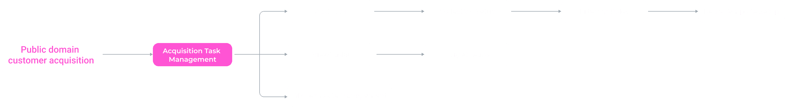
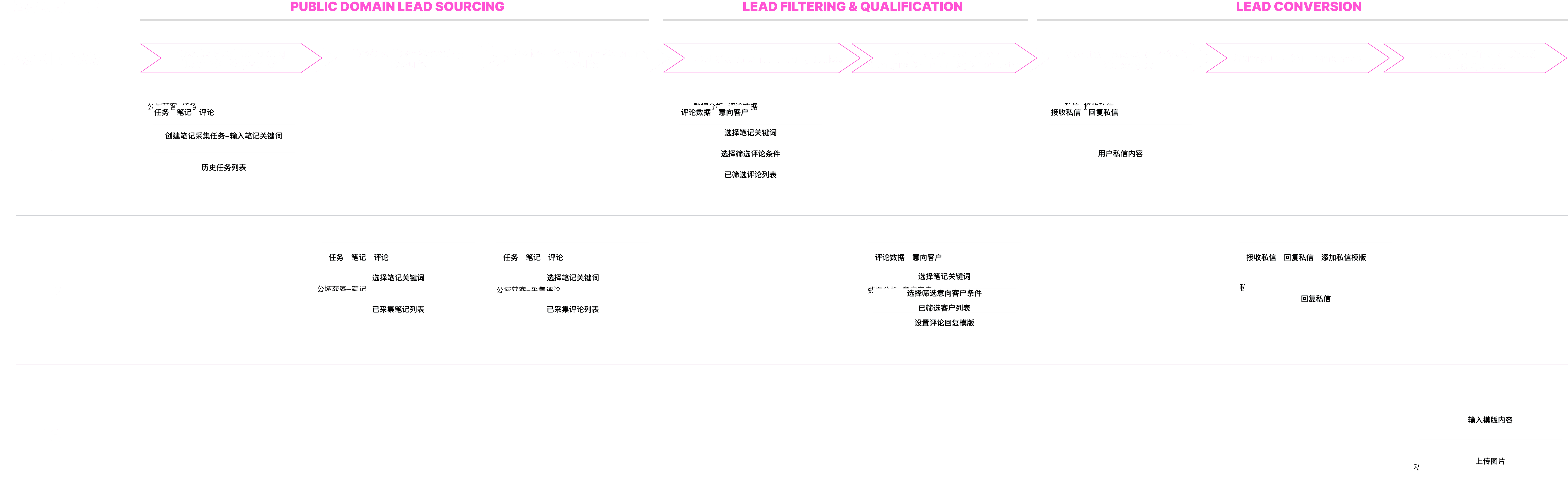
Task Flow – Task Logic Reconstruction (Before vs. After)
1. Original: Scattered Process (Before)
Disconnected Stages: Users had to navigate between three independent modules—Data Collection, Lead Analysis, and DM Management—to complete a single acquisition cycle.
High Switching Cost: Frequent page switching led to a fragmented experience and increased the risk of information loss.

2. Merged Workflow: Smart Acquisition (After)
Linear Task Progression: The new flow integrates the entire process into a single path: Add Task → Collection Setup → Smart Filtering → Template Mapping.
Reduced Operational Complexity: By merging the "Public Domain Acquisition" and "Lead Filtering" stages, users no longer need to jump between modules, significantly lowering the learning curve.
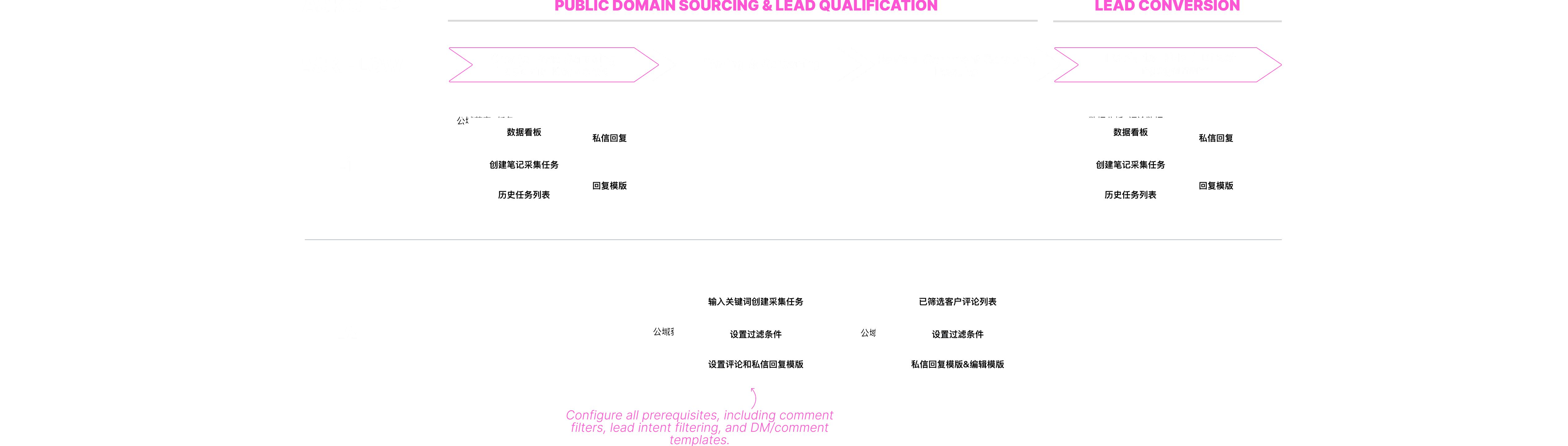
Site Map: Structural Flattening
Before: Fragmented Entries
One task was split across 3 service flows and 8+ sub-pages, requiring high navigation cost.
After: Homepage Centralization
Functional Aggregation: Unified "Keyword Sourcing," "DM Content," and "Reply Templates" into the Homepage to minimize scattered entries and boost efficiency.
Task Dashboard: Integrated a real-time digital dashboard on the Primary Page for instant monitoring of task performance and overall progress.
Merged Workflow: Consolidated "Lead Sourcing" and "Qualification" into a single "Smart Acquisition" flow to eliminate redundant steps and complexity.
Simplified Configuration: Replaced page jumps with Pop-up Modals and linear interactions to centralize information and prevent context fragmentation
Result
By consolidating the fragmented architecture into a centralized L1 Dashboard, the system achieved a 60% reduction in the task completion path. Core interactions were streamlined from 15 to 9 clicks, while task configuration time plummeted from 15 minutes to just 1 minute.
The new "Batch Configuration & Collective Waiting" logic eliminates the need for step-by-step manual monitoring, granting users operational freedom. Combined with a unified "Smart Acquisition" flow, the redesign boosted daily lead processing efficiency by 40% and significantly lowered the learning curve for new users
UI Showcase
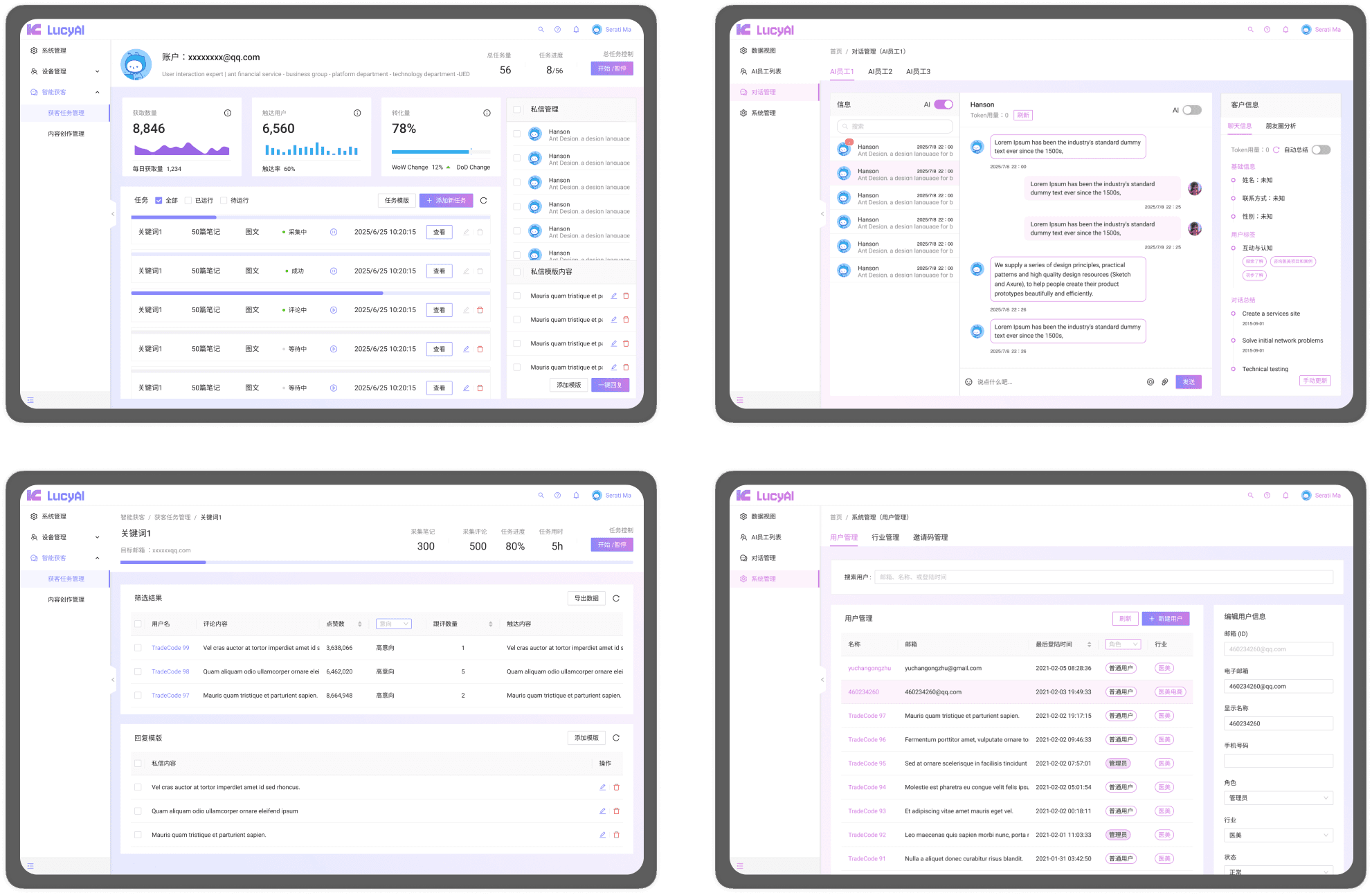
01

02

03

see also


