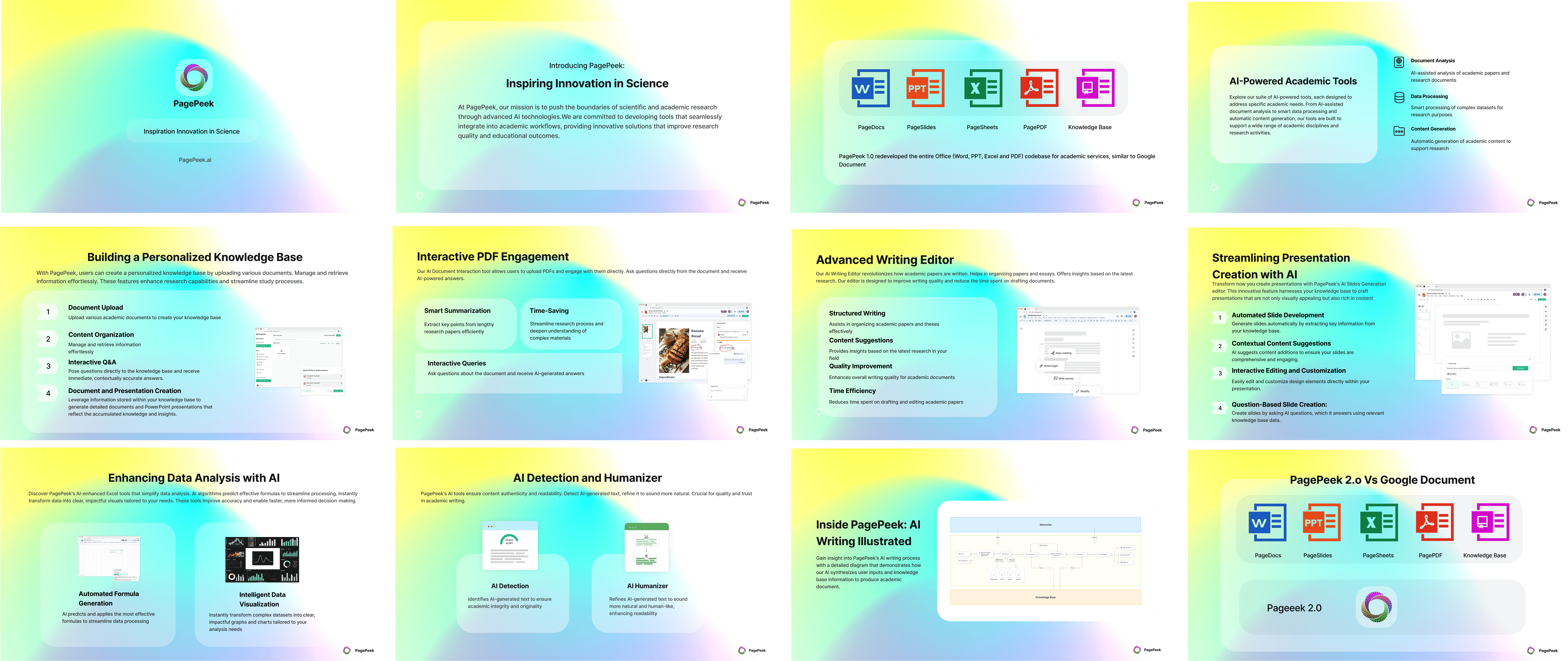
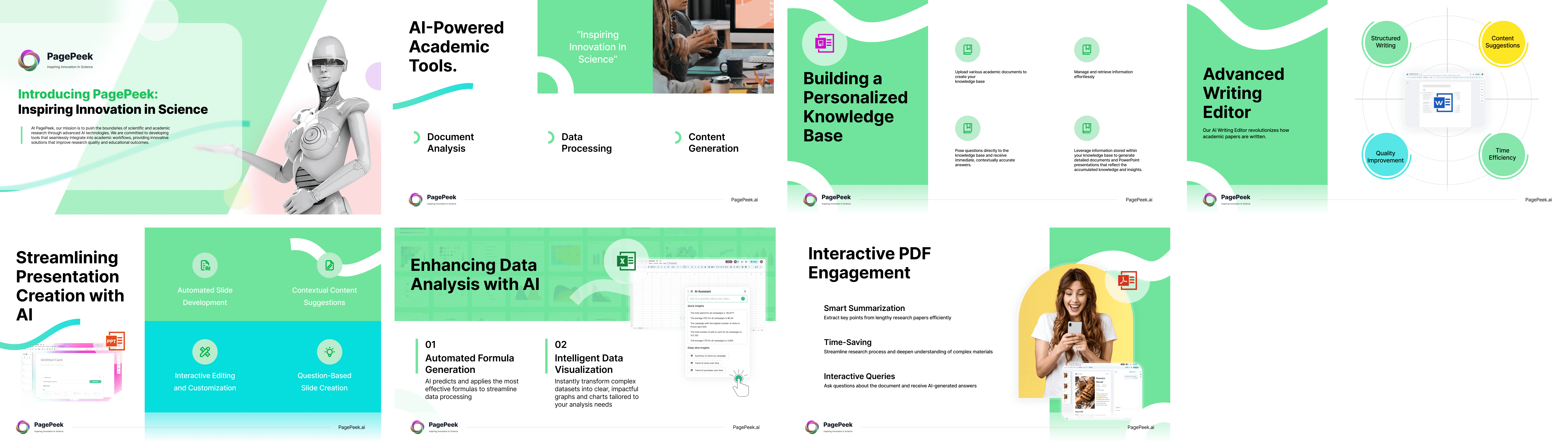
PagePeek
An AI‑powered academic workspace that turns research, writing, data, and presentations into a unified, intelligent workflow.
00

challenge
• Post-Launch Instability: High volume of critical bugs emerged during the initial large-scale promotion. • Time-Critical Branding: Urgent demand for full marketing assets and VI identity two months prior to launch. • Future Feature R&D: Need for preliminary research and model testing for "AI Professor" and "Idearna".
solution
Led user research and interaction optimization to refine the "AI Humaniser" workflow through Figma prototyping and A/B testing. Simultaneously managed cross-departmental collaboration to build the UI system, fix bugs, and deliver 0-1 branding assets for market promotion.
impact
• 90% Retention Rate • “AI Humaniser” 12% Task Lift • 7M+ Ad Impressions
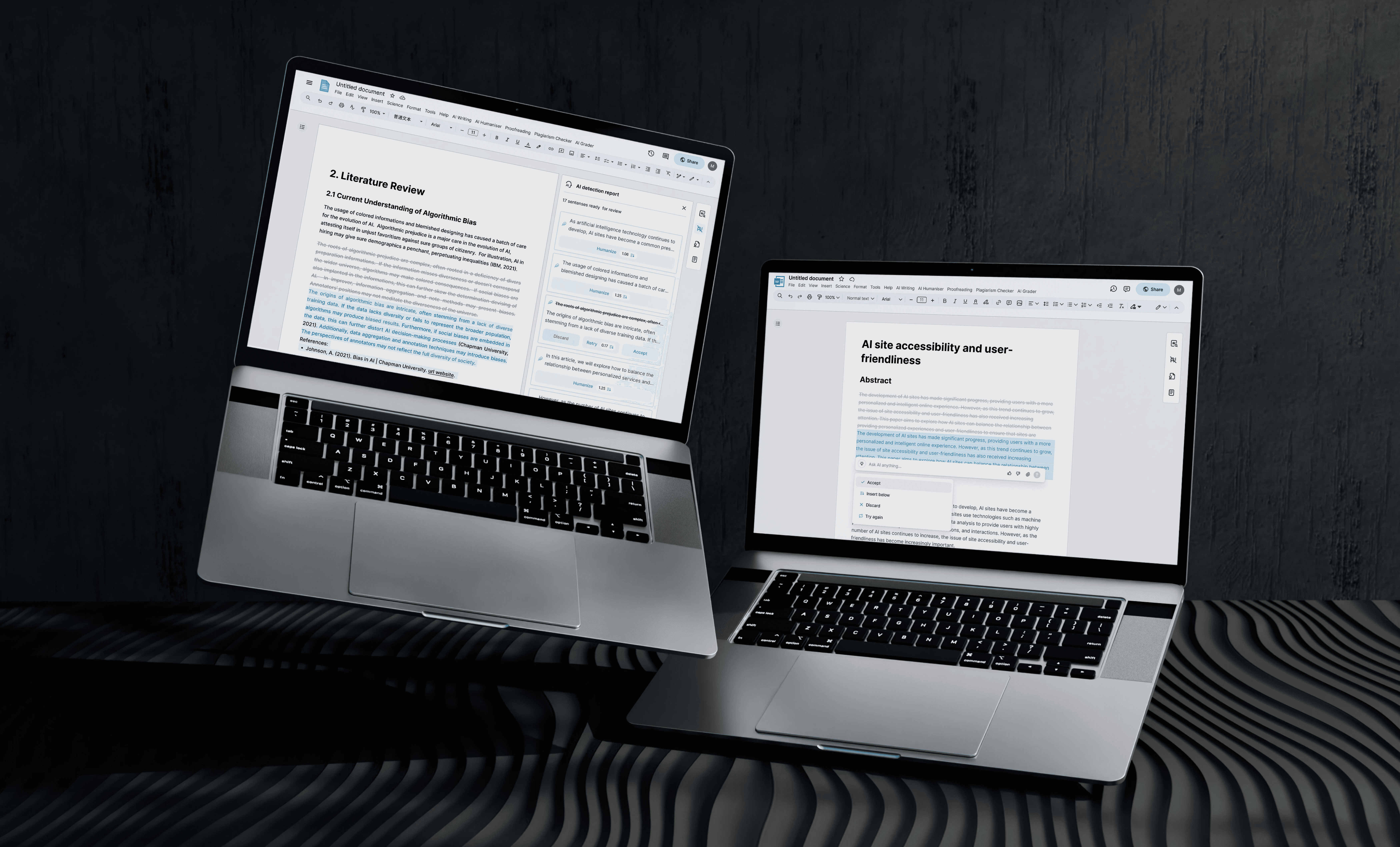
Card Optimization for Sentence Revision
The Problem
Heatmap analysis revealed high-frequency misclicks on non-interactive elements, indicating that users were struggling to navigate the revision workflow. My observations showed that users often felt "trapped" because the original interface lacked a clear "Accept" state, and ambiguous labels—such as "Revert" versus "Retry"—caused significant hesitation. This lack of clarity led to frequent accidental data loss and rage clicks, which directly hindered revision efficiency and undermined user confidence in the tool.
Design Strategy
I restructured the entire workflow into a more intuitive "Discard–Retry–Accept" loop. I Changed Revert to Discard to avoid user misunderstanding it as "going back," using more intuitive language to express "accepting changes" and reducing cognitive load. I also implemented a semantic color-coding system—Red for Discard, Green for Retry, and Blue for Accept—which allows users to instantly distinguish between actions without needing to read the labels carefully.
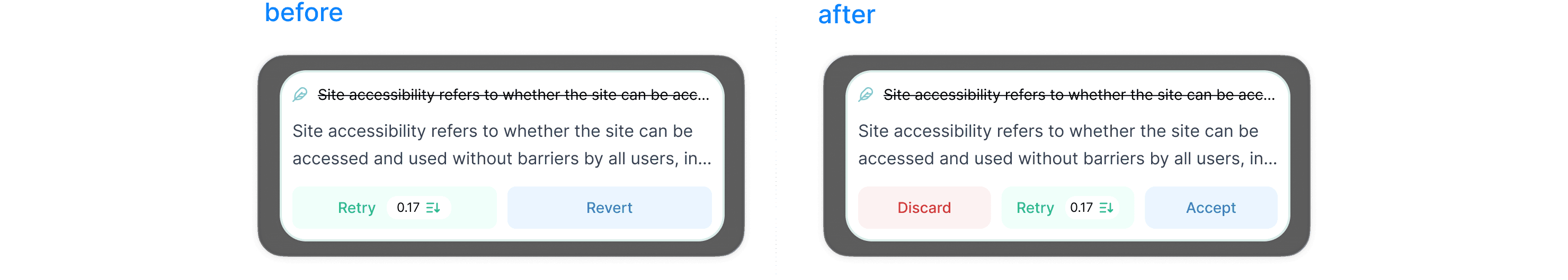
Additionally, I resolved a layout issue where the sidebar card overlapped with the main document content, ensuring a clean, distraction-free editing environment.
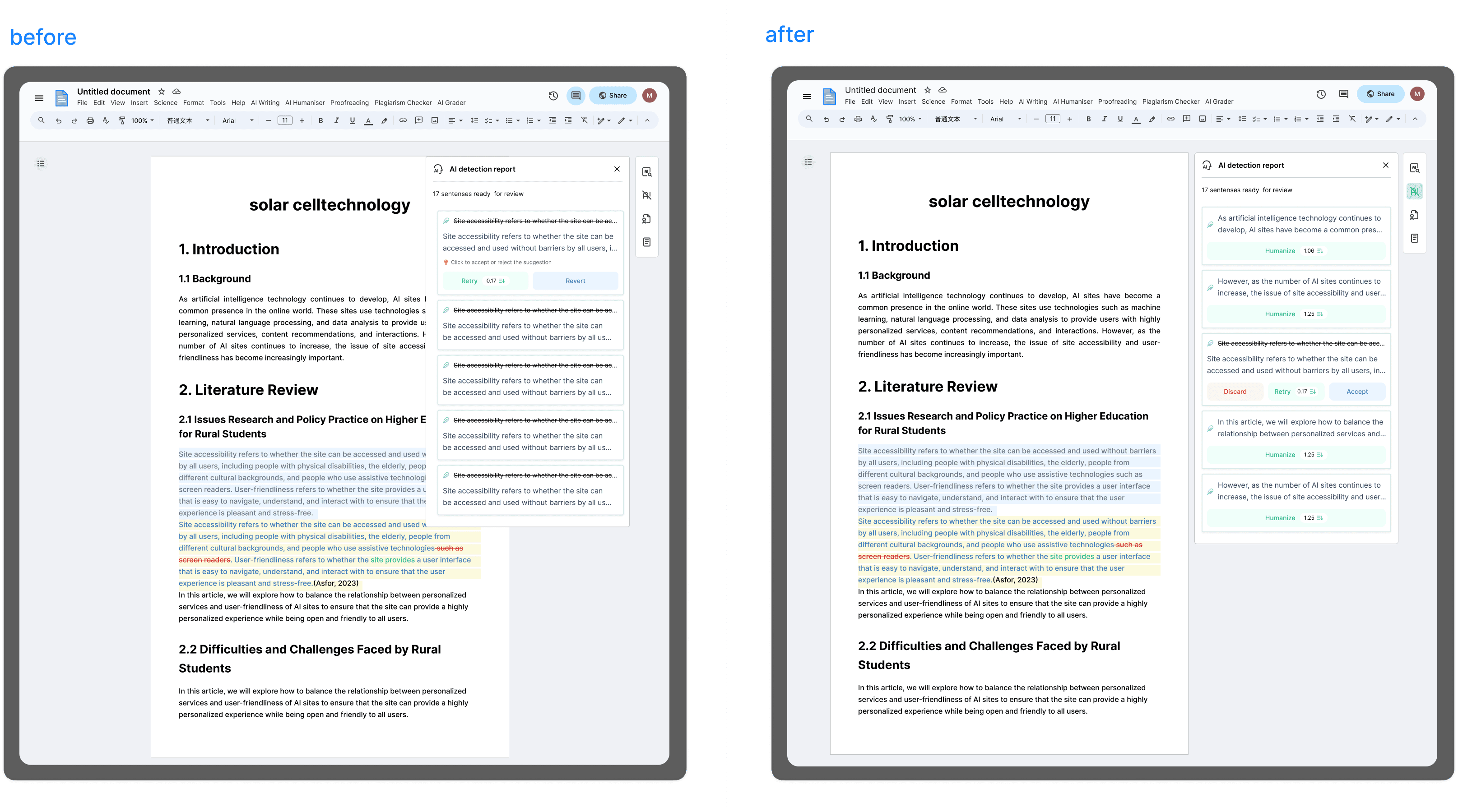
Results
The redesign of the revision workflow and the resolution of layout conflicts collectively yielded a 12% increase in task completion rates. By implementing a more intuitive "Discard–Retry–Accept" loop and a semantic color-coding system, I minimized user hesitation, eliminated sidebar-to-content overlaps, and fostered a stable, distraction-free environment that significantly improved overall user confidence and interaction efficiency.
Content Editing & Display Optimization
The primary challenge in our editing workflow was "markup fatigue." After analyzing user behavior logs and identifying a recurring drop-off point during the revision stage, I realized that the interface intermingled original text, revisions, and strikethroughs within the body, creating a cluttered environment that forced users to mentally parse complex color-coded markers. This cognitive burden frequently disrupted the reading flow and delayed decision-making.
To resolve this, I prioritized visual hierarchy and content isolation. By moving heavy editing markers and strikethroughs out of the main body, I allowed the document to "breathe" again, shifting the user's focus from the editing process back to the content itself. For current revisions, I introduced a subtle blue highlight that maps directly to the "Accept" action, establishing a clearer link between visual changes and user intent. This transition from complex, mixed-state display to a streamlined, intent-focused view significantly accelerated the revision cycle.
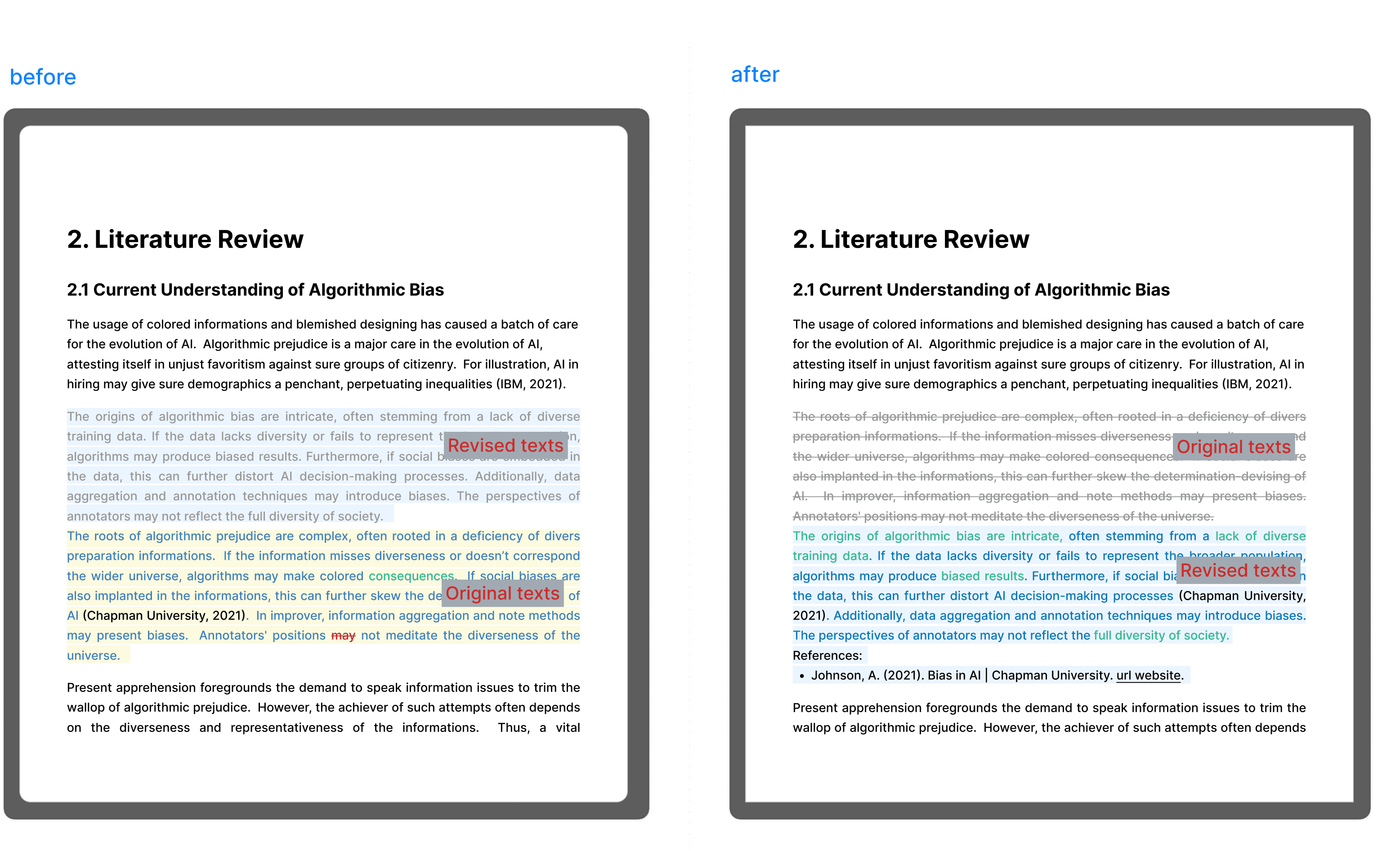
Beyond visual clarity, I streamlined the academic workflow through automated citation linking. Previously, inserting a citation felt like a "dead end"—there was no immediate system feedback or active connection. I redesigned this interaction to be proactive: the system now fetches and links references instantly upon insertion. By replacing manual effort with system automation, I not only reduced the user’s cognitive load but also ensured the integrity and accuracy of academic references within the document.
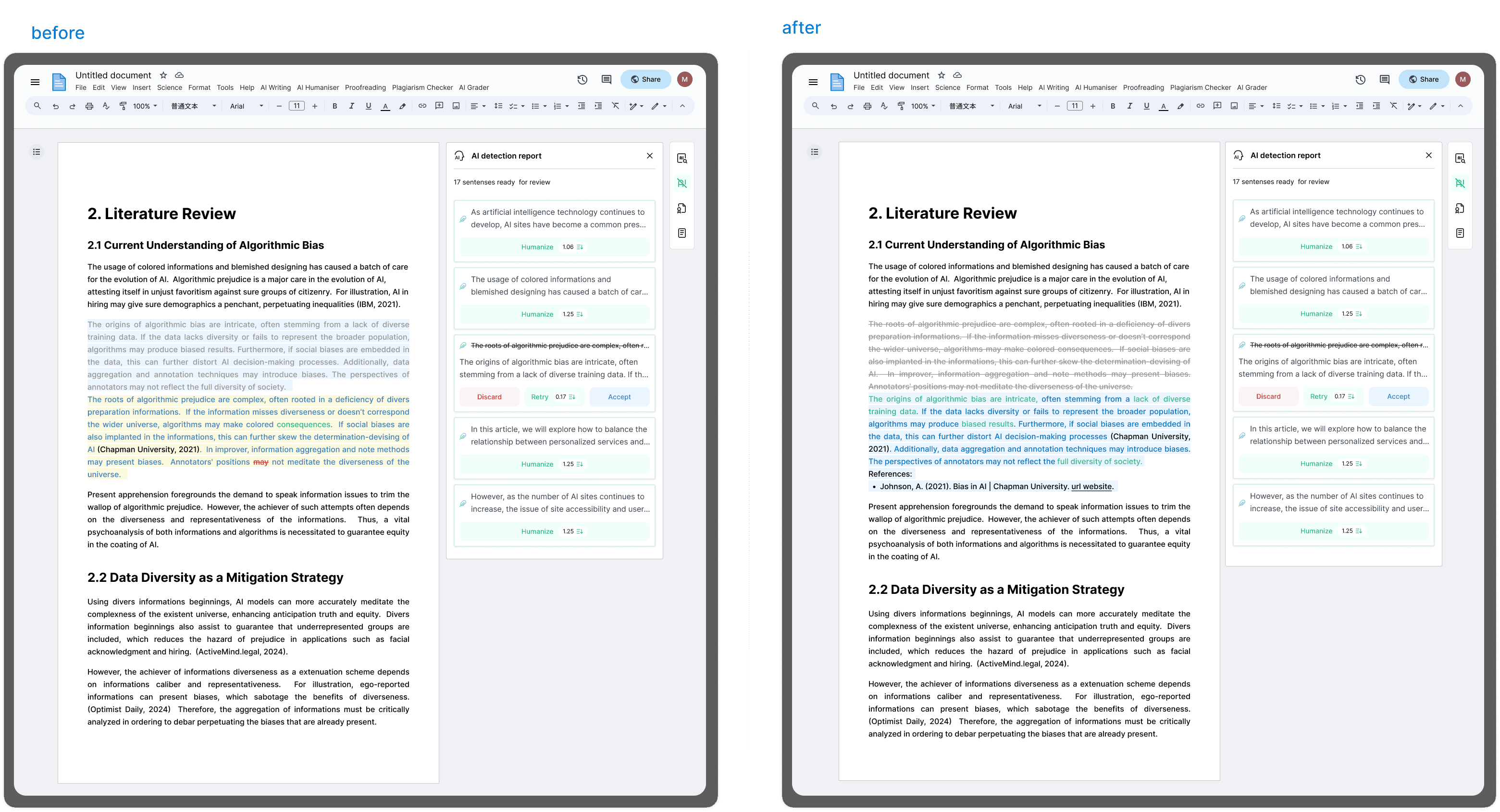
Impact
Following an A/B test implementation, the Task Completion Rate increased by 12%.
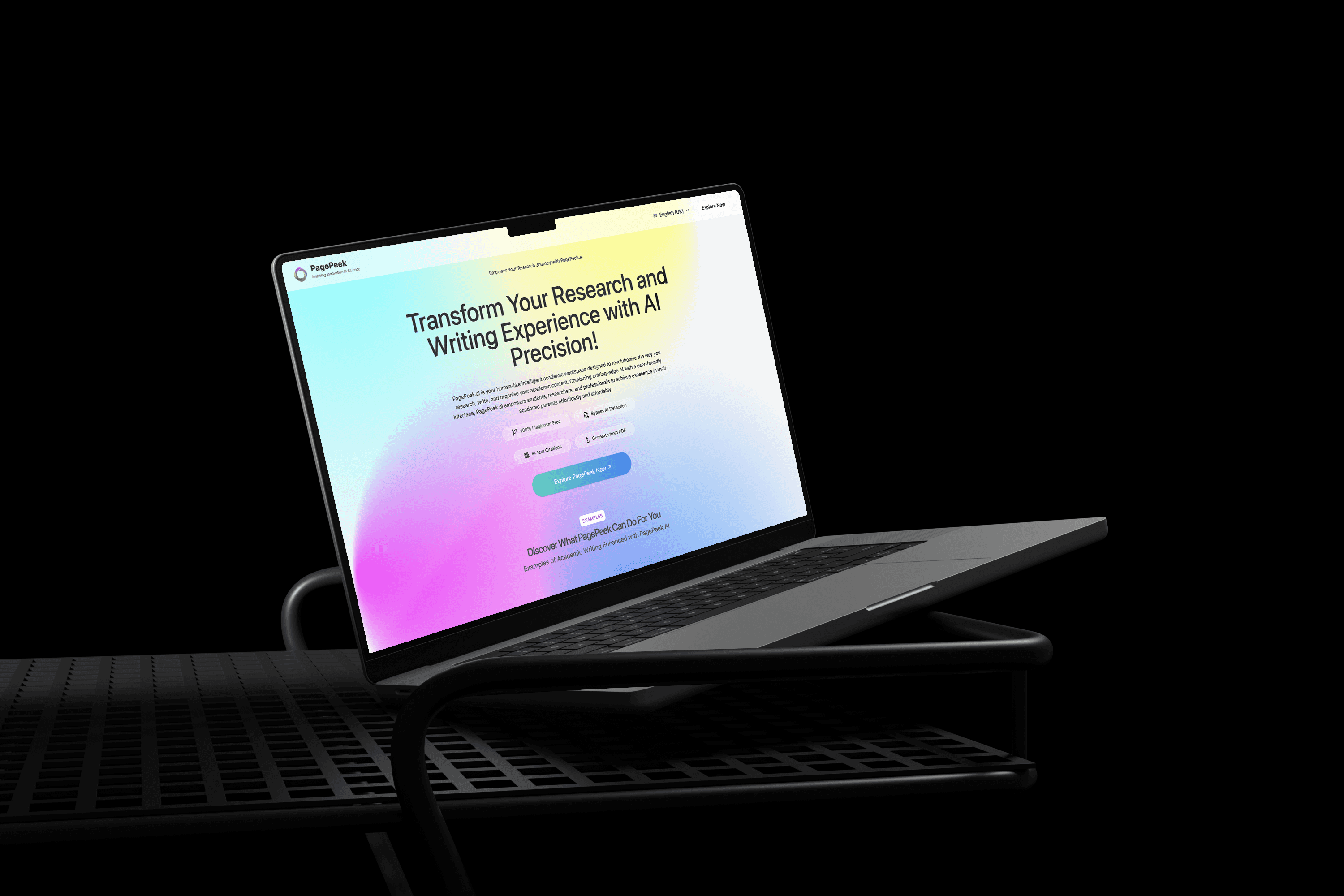
Landing Page Design
The PagePeek.ai landing page creates an atmosphere that blends technology with academia through the use of gradients, paired with a modular information architecture and clear interaction logic to accurately convey the product values of being "efficient, professional, and trustworthy." By utilizing concise, intuitive functional displays and clear Calls to Action (CTA), the page helps students and researchers quickly understand and try the tool, ultimately enhancing the academic writing experience.
year
2024-2025
timeframe
5 months
tools
Figma, Adobe creative suite, Google Analytics, Google Ads
category
UI/UX
main tasks
1.User interviews and task flow diagrams 2.Optimization of "AI Humaniser" feature's interaction logic and UI structure 3.A/B testing execution and task completion rate tracking 4.User feedback collection 5.Frontend collaboration for UI standards and bug fixes 6.Produced marketing materials 7.Coordination with external teams for brand promotional videos and advertisements 8.Digital advertising strategies, campaign launch, data monitoring
01
02
03

04
05